


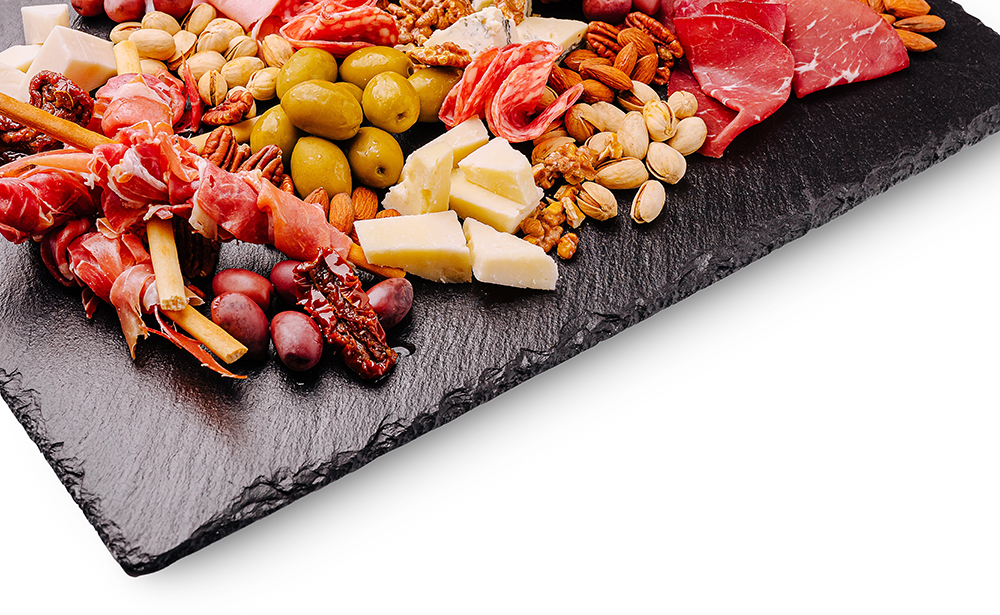
The Art of an Instagram-Worthy Charcuterie Board
Creating an Instagram-worthy charcuterie board is about far more than simply arranging meats and cheeses on a platter—it’s about designing a visual experience that tells a story through color, texture, and seasonal personality. The most eye-catching boards feel intentional yet abundant, combining contrasting shapes and thoughtful styling that draws the eye in from every angle. Lighting and composition matter just as much as what you place on the board, but the real magic comes from layering different heights and adding unexpected decorative touches that elevate the entire presentation. One of the most effective ways to make your board stand out on social media is to incorporate non-food elements that match the season, such as small pumpkins or gourds in the fall, fresh florals in spring, citrus accents in summer, or evergreen sprigs in winter. These small styling details transform a simple grazing platter into a curated centerpiece that feels festive and highly shareable.
Spring Styling: Fresh, Floral, and Light
Bright Colors and Floral Accents
Charcuterie boards shine when they feel fresh, airy, and full of life. Think soft pastel tones, edible flowers, fresh herbs, and bright seasonal produce like strawberries, grapes, and radishes arranged in loose, organic clusters. Adding non-food elements such as fresh tulips, daffodils, or scattered flower petals around the board enhances the feeling of renewal and makes the entire spread more visually dynamic for photos.
Spring Composition and Light Textures
In the spring, lighter cheeses like goat cheese, brie, and mozzarella pair beautifully with delicate crackers and crisp vegetables. The goal is to avoid overcrowding and instead focus on open, breathable spacing that lets each element stand out. Natural daylight works best for capturing spring boards, especially when paired with wooden boards or marble surfaces that reflect softness and freshness.
Summer Styling: Bright, Bold, and Vibrant
Hot-Weather Colors and Tropical Energy
Charcuterie boards in summer are all about bold color and abundance. Vibrant fruits like watermelon, pineapple, cherries, and berries create a lively palette that pops on camera, while fresh herbs like mint or basil add contrast and freshness. To elevate the seasonal theme, you can incorporate non-food accents such as citrus slices arranged decoratively around the board or colorful linen napkins that frame the display.
Summer Arrangement and Outdoor Appeal
Summer boards feel most natural when styled for outdoor settings like patios, picnics, or poolside gatherings. Use a mix of juicy fruits, salty cured meats, and refreshing cheeses to balance heat and flavor intensity. Keep the arrangement slightly casual and overflowing to create a relaxed, abundant look that feels spontaneous yet intentional in photographs.
Autumn Styling: Warm, Rustic, and Cozy
Fall Colors and Seasonal Decor
Charcuterie boards made for the summer solstice embrace warm tones like deep reds, oranges, and golden browns, making ingredients like figs, apples, aged cheeses, and cured meats especially fitting. This is also the perfect season to incorporate non-food decorative elements such as small pumpkins, gourds, cinnamon sticks, and dried leaves to reinforce the cozy autumn atmosphere. These additions instantly make the board feel seasonal and visually rich, especially in photographs.
Fall Layout and Rustic Textures
An autumn board should feel hearty and abundant, with denser arrangements and richer textures. Wooden boards, slate platters, and rustic serving pieces enhance the seasonal mood while supporting bold flavors like sharp cheddar, prosciutto, and spiced nuts. Layering ingredients more tightly together creates a sense of warmth and indulgence that photographs beautifully in soft, golden-hour lighting.
Winter Styling: Elegant, Festive, and Refined
Cooler Colors and Holiday Accents
Cold-weather boards lean into elegance with deep greens, reds, whites, and metallic accents. Ingredients like grapes, pomegranate seeds, rosemary sprigs, and aged cheeses create a refined and festive palette. Non-food elements such as pine branches, pinecones, candles, or subtle ornaments can be added around the board to enhance the holiday aesthetic without overwhelming the food itself.
Warm Presentation and Cozy Atmosphere
Holiday season styling is all about creating warmth and sophistication. Layer cheeses, meats, and accompaniments in structured sections to give the board a polished, curated feel. Soft indoor lighting, candlelight, or warm-toned lamps help create a cozy ambiance that highlights the textures and colors, making the entire spread feel inviting, celebratory, and perfect for holiday entertaining.
A Board That’s Made to Be Shared
At its core, an Instagram-worthy charcuterie board is about blending creativity, seasonality, and thoughtful presentation to create something that feels both beautiful and inviting. When you combine fresh ingredients with intentional styling and seasonal accents—whether it’s spring florals, summer brightness, autumn pumpkins, or winter greenery—you turn a simple spread into a visual experience worth capturing and sharing.


 ';


